In meteorology, weather model visualization has become increasingly crucial. While numerical improvements in models are essential, the ability to display and communicate these advancements visually can make or break a model’s adoption and success.
There’s an assumption in weather that if you build the best model, users will beat a path to your door. Most companies and institutions figure out relatively quickly that’s not the case. Users need a well-lighted and maintained path to your door, at the very least, and probably a map to your neighborhood to even get close.
Fighting Against ‘Good Enough’
A couple of years ago, I was wandering around a trade show looking at marketing, and some copy for an advection system stuck with me.
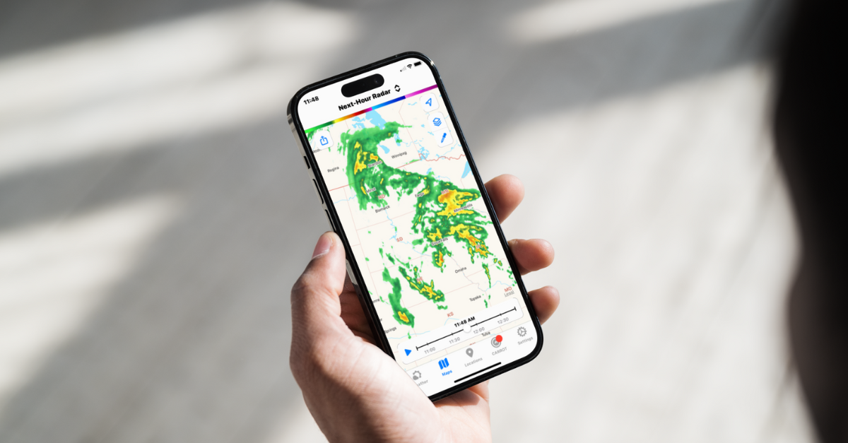
In this context, they meant running radar data forward in time to give customers real-time estimates of rainfall or other conditions at a particular location. You’ll often see this called ‘future radar,’ and it’s a popular display in products like Carrot Weather.

Their pitch was that their advection system was 14% better than pysteps, a Python-based library you can get for free. That’s a valid way to compare your system, but it did leave me with a different impression: I can get a 14% worse system for free!
We have used pysteps in the past, and it’s just fine for many use cases. And I’m sure their system was better, but sometimes it’s difficult to make that argument. Sometimes, you just have to show us.
Use Weather Model Visualization to Show Us Your Data!
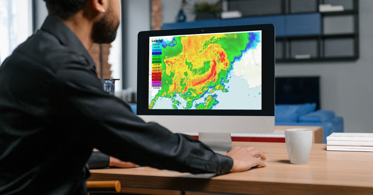
Numbers are how modelers drive their work forward. How much more accurate is this model than the baseline? Does it detect a specific category of event more reliably? Weather model visualization is critical to demonstrating the value of your improvements. But for many things… well, I want to see it.
Things I love to actually see:
- If you’re downscaling a forecast (increasing its resolution)
- If you’ve got a higher res forecast than the standard
- Pretty much any WRF domains
- Anything with wind. Wind responds to terrain in interesting ways.
Is your data better? Show us! Ideally, with an interactive display where I can compare it to whatever you’re better than.
Granted, there are downsides to taking your measurements out of context.
Downsides of Visualization
While weather model visualization can be powerful, it’s essential to consider potential downsides. Living in San Francisco, I’ve seen how visualizations can highlight both strengths and weaknesses in model performance, especially in areas with complex microclimates.
We have some interesting microclimates that need to be captured better in GFS or even HRRR. If your downscaled forecast covers San Francisco, I can usually eyeball it to see what you’re doing. No one ever seems to get our marine layer right.
Failing my hometown, I’ll head for just about any coastal city. Temperature is a good indication of what a model takes into account, and it’s interesting to see how it handles the transition to water. Wind in urban areas is another interesting one, though often not handled directly.
Maybe a given model or process wasn’t designed for my particular obsession or local area? Models specialize even more now that there are so many of them. So I say embrace it!
Weather Model Visualization Can Make Your Point
Weather model visualization is not just a nice-to-have feature; it’s becoming essential in meteorology. By embracing visual representations of your data and models, you can communicate their value, improvements, and limitations more effectively. In a world where users can access ‘good enough’ free options, compelling visualizations can set your weather model apart and demonstrate its true worth.
Yes, putting it all out there can make it obvious that you have boundary problems or glitch out at hour 50 for some reason. However, it’s still worth it.
There are always flaws. We’re all aware of the complexity of snow totals on the East Coast compared to their relative importance (very). Every model has flaws, and every process has downsides. Yours is going to have some, too.
But your new model has a lot going for it, and a dry set of numbers isn’t going to do the job. Show your users!

